Uitgelicht

Glanceability introduction

11.11 / 12.11

Monday was the kick-off of course 2, Tangible and Embodied Interaction. This course is subdivided into a number of different modules. And this week’s theme was Glanceability.

But what is Glanceability?


Glanceability refers to the perception and interpretation of information after
the user is paying attention to the interface
– Tara Matthews –

[…] enables people to get the essence of
the information with a quick visual glance

– Gouveia et al. –

So in short, an interaction that offers information and lasts no longer than
5 seconds. A simple example of this is: quickly look at your smartwatch to see
if you have received messages.

But before we went into depth on glancebility, we received information about
“cognition”. Because I studied psychology for a year, I came into
contact with this term a lot. And I mainly know cognition in it’s traditional
meaning, namely: “the mental action or process of acquiring knowledge
and understanding through thought, experience, and the senses”
.

But what struck me during the presentation was that here a different meaning was given about the concept of cognition. It was described as a mix between psychology and philosophy. For example, cognition does not only relate to the interpretation of information but also the processing thereof. And how our brains make logic from this information.

It was interesting to think about cognition in this way. However, I do not yet see the relevance of this in relation to the traditional interpetation of cognition. That is also because we went through it quickly, I would like to have elaborated on this. In order to know better how I can use this in my design process.

After the presentation we had to read three articles about Glanceability. These articles were the subject for the seminar that took place on Tuesday and formed the basis for the project that we have to present on Friday.

Seminar

During the seminar we started a conversation about the articles that we had to read. This was the first time I experienced a seminar, and I didn’t know what to expect in advance. In preparation, we had received a number of questions related to the articles.

My overall experience about the seminar is positive. You learn to look at articles in a completely different way than I am used to. My overall experience about the seminar is positive. You learn to look at articles in a completely different way than I am used to. Thus the seminar started with a legitimate question: “Who wrote this article and you checked the author?

I had not thought about this myself. But of course it makes sense, if the author of the article has a bad reputation, that says something about the legitimacy of the article. I did, however, see that all three studies come from an American university. And normally I try to avoid American research as much as possible because they are often funded. But because they are fairly recent, that is a good sign that they are legitimate. So from now on I will specifically look up the authors of the article to do a check on whether I can trust the article.

Another interesting point that came up during the seminar was the following: “Is my design good for society?”. Everything we are going to design as interaction designers will have a certain impact on society. A glaceble interface requires a lot of attention from a user by continuously sending notifications. Which can potentially influence the condition of a user. It may therefore be good to offer a user the option to turn off these notifications.
AI & interaction presentation

06.12

The final presentation took place on Friday. And overall it went well. The story was clear and the reason why we came up with the final concept was strong. The feedback we received was interesting and valuable. For example, the question arose as to the minimum amount of movement required to recognize a movement. We have not thought about this too much while interacting with the prototype. But we certainly have an idea about how accurate the movements should be.

We have now used the location of the hand on the vinyl as input to recognize a tone. But in the future we could look at the length of the movement or the speed to create a sound based on it. To create an even stronger connection between sound and movement in this way.

We also received feedback about our finding about adding visual feedback. Where the DJs use small pieces of tape as an extra check where they are, that visual feed back was missing from our prototype. This is a limitation of technology, but it would certainly be interesting to look for a way to replace it.

I would also like to add some form of haptic feedback if I still had time. DJs feel the record player’s movement to determine how far they can move the records. This ensures an even stronger interaction between the technology and the user. Because after a certain distance you cannot turn the record player further back. This limitation ensures that DJs handle their record players very carefully. Which in turn fits in with the subtle movements that we want to measure.

AI & interaction project

05.12

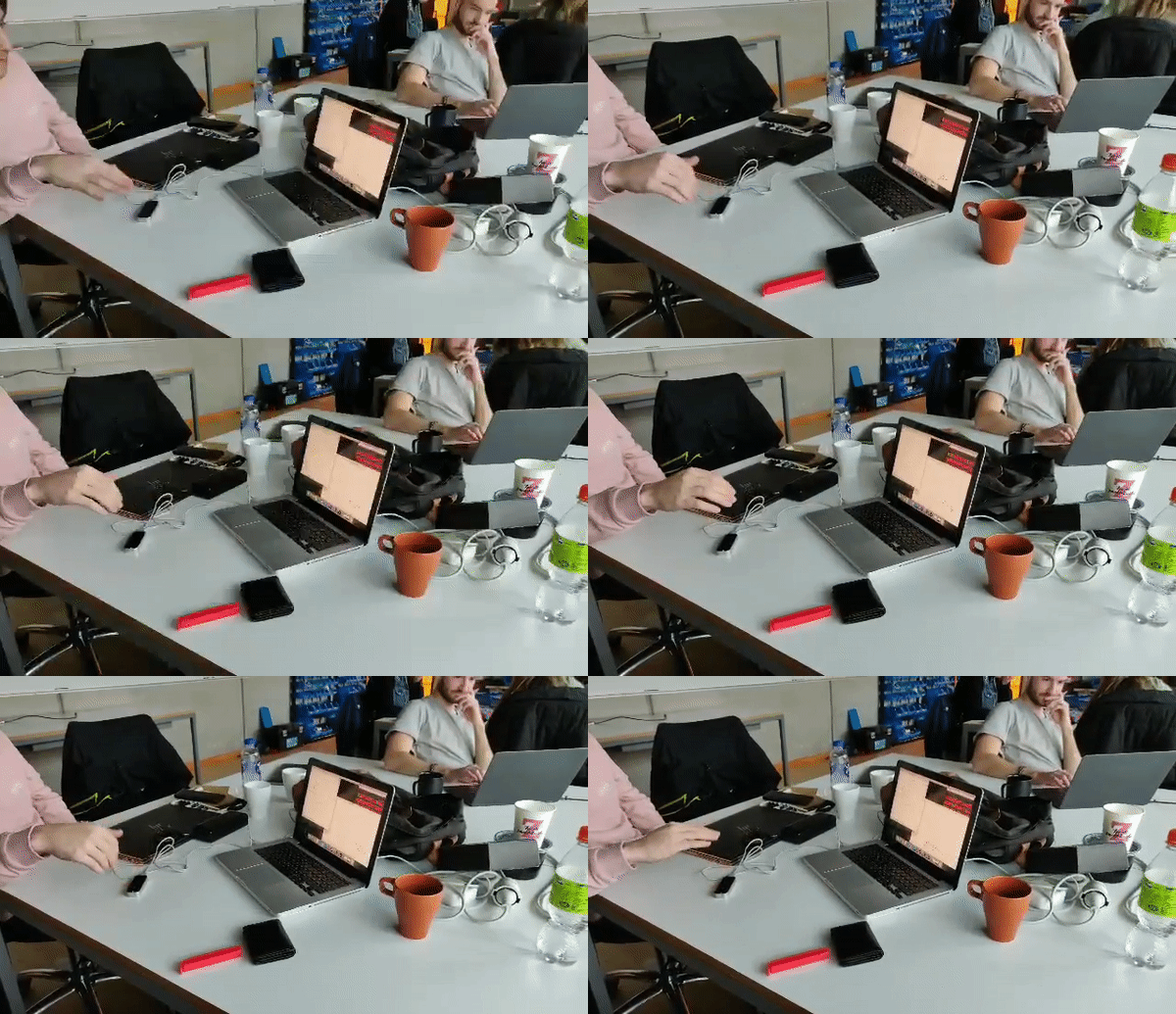
Thursday we made the project and the presentation. During the tinkering we have already tried several things but have not yet made a logical thing of everything. So we started with the code where we left off and looked at how the interaction felt.

And after some brainstorming, we saw a link with scratching. From the literature (Kameron Christopher et all. 2013) we were interested in subtle hand movements. And whether the program can detect these subtle movements. And by performing subtle hand movements it felt like we were scratching.

And in addition to the finding that the movement resembled that of scratching, we saw another link. We were making sounds in a very unconventional way, by testing the possibilities of the available technology. And scratching was also created in this way. Scratching was normally something that DJs didn’t play and used to make a loop in music. Grandmaster flash is seen as the founder of scratching because he first made music with this sound. And thus using existing technology in an unusual way to create a new form of sound. And just like with AI, it is an interaction where precision is very important. Both during preparation and execution.

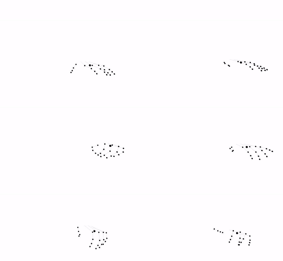
And after learning the program again a few times we had a version that we were happy with. It could recognize certain hand gestures and play the correct sound on it. It was not perfect because we work with subtle differences.

If we had more time we would have linked it to real record players so that our hand movements were more accurate. And if this worked, we could have linked these hand movements to other sounds to add an extra layer to existing scratching.

AI & interaction intro

02.12 / 03.12 / 04.12

This week is centered around AI (artificial intelligence) in combination with interaction. We started this week with a presentation about what AI is and how the logic behind it works. AI is based on fuzzy logic. Which means that it is not true or false, but relatively. For example, my laptop can be large compared to other laptops. So fuzzy logic would categorize my laptop as large. But compared to a wider category of electronic devices, my laptop is small. So fuzzy logic would categorize my laptop as small.

AI trains itself by comparing several examples and drawing conclusions based on the number of examples. And just as we humans learn to categorize and recognize objects within a category. Is something an animal? If so what kind of animal is it, is it a cat or a dog?

After the presentation we went to work with a program made by Google that tries to recognize a drawing ( https://quickdraw.withgoogle.com/ ). I have done a number of projects with AI in the past. And the basis is always the same. But it was not wrong to start again from the basics. For example, I did not know that Quick draw existed. And I was amazed at how well the program worked. When I tried, the program managed to recognize four of the six drawings of mine. Which I think is quite a lot, especially with my level of drawing.

I spent the rest of the day reading the articles. And especially the first article (Frédéric Bevilacqua et al. 2016) I found interesting. It was fairly short but filled with useful information. I found the part about sound-oriented tasks and movement-oriented tasks particularly interesting. It is a good way to direct the user’s attention and make a distinction between these two ways. And that there is interaction with sound or movement in this way.

In my opinion, the other two articles were more a description of a project. And despite the fact that they were interesting, she served more as an inspiration and I don’t see a direct link to what I can do for this project. I did however find the “butterfly effect” described in the second article (Kameron Christopher et all. 2013) an interesting concept. This means that Tiny finger gestures can be used to control very fast repetitive movements. Which of course is an essential part for a musician.

Our project for the week is to create a digital music instrument by using some kind of input (f. ex. webcam, microphone, Arduino). Tuesday was mainly devoted to setting up everything and tinkering with processing and Wekinator. Wekinator is a program that uses AI to form a link between input and output. The input that we are going to use is the leap motion sensor, this is a sensor that can record very accurate hand movements.

Data Phys presentation

26.11 / 27.11

Thursday was all about making the prototype and the presentation. We already had a number of ideas for the prototype on Tuesday. So this was a good starting point for today. So we had finally planned to make two forms of the prototype.

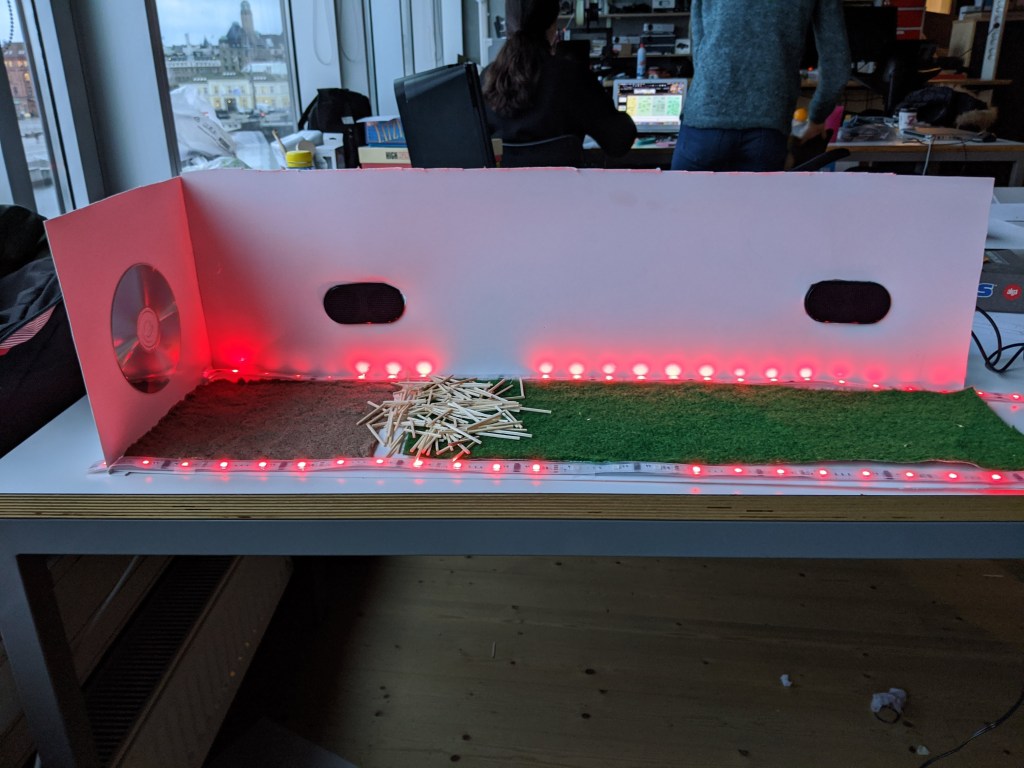
The first prototype consisted of a miniature version of the concept. This was intended to communicate the various steps that a user goes through. And what takes place at every step within the user journey. For example, the soil is made of the material that the users will eventually walk over. The miniature version must also convey a sense of scale.

The other prototype is intended to simulate part of the experience. It consists of a light strip that moves based on the speed of the user. This is intended to simulate the lights that come on based on the movement of the user. This was mainly so that we could test what it feels like to walk down the corridor. And after trying it myself, I noticed the impact of the lights. And in my opinion a good metaphor to indicate speed. I also felt as if I had entered as a user at the speed of the lights. Even though it was a simple prototype that was operated by a teammate.

The disadvantage of both prototypes is that the light is red. This does not communicate the sense of nature as we wanted. And unfortunately we do not have the time to adjust this for the available time that we still have.

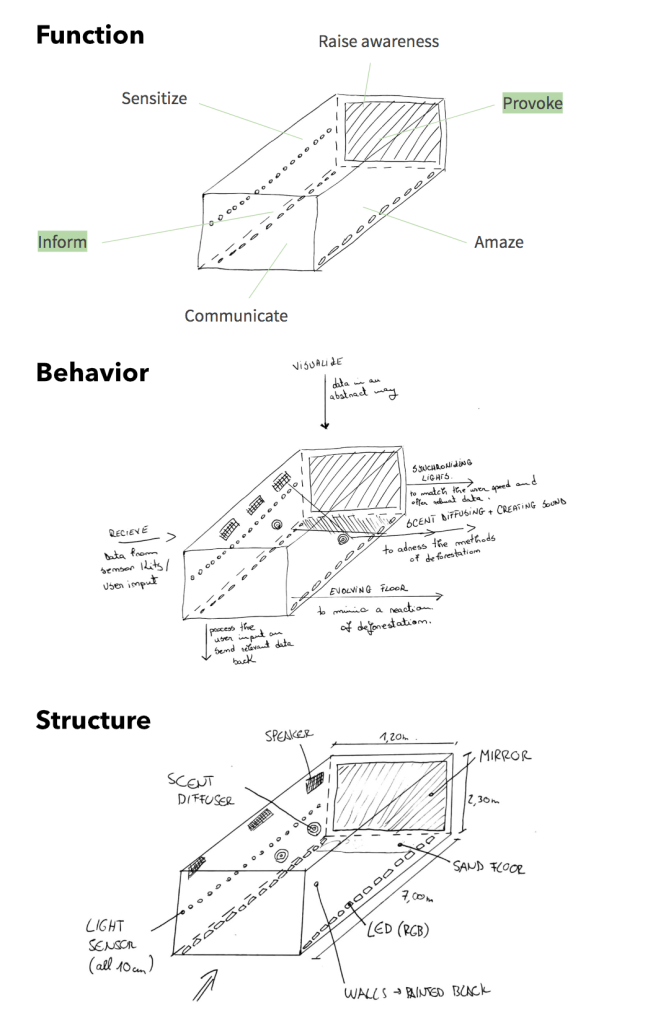
While working on the prototypes, we also took the time to prepare an FBS (Function, Behavior, Structure) diagram.

  • Function: Informing, provoking and raise awareness
  • Behaviour: Stimulating multiple senses based on data from deforestation.
  • Structure: Light (LED), sound (speakers) and scent (scent diffusers.)

An image of this can be seen below:

Unfortunately I could not be present during the presentation. But I kept in touch with my team about the process of the project. My team knew about my absence and I got permission from each team member.

The feedback we received after the presentation was mainly focused on the first prototype. As expected, we were told that the lights had to have a different color (preferably green) in order to relate more to nature. And this would indeed make the prototype a lot clearer and better communicate our purpose.We also received feedback on the use of grass at the start of our concept. This does not communicate deforestation well enough and using only sand would achieve the same goal if not better. I agree with this last point. It can be experienced as distracting when the topic is about trees and you feel grass.

Data Phys Seminar

25.11

The seminar took place on Wednesday. In preparation for the seminar, a number of questions were given that were discussed during the seminar. This was a nice form of preparation. I had read the articles but I could not answer all the questions right away. For example, there were concepts that I understood in the context of the article, but could not immediately explain.

For example, the difference between a bit and a Tangible Bit was asked. And through this question I elaborated on these topics, making them even clearer to myself. And because of this all these topics became clearer, I was able to form a clearer opinion about the articles.

For example, the first article (Jansen et al., 2015) talks about depth perception. This means that a data physicalization is more accurate than a data visualization. Since physical objects give rich cues of shape and volume. I believe that this is not true, since there are no exact numbers in a data physicalization. While a data visualization often communicates this. So I would say it’s not more accurate then a “normal” digital visualisation. This also came up during the seminar. And there were more people who shared this opinion.

There was another interesting discussion about this article. There are a number of paragraphs that deal with the importance of implementing multiple senses in a data pyhisicalization. But the examples mentioned in the article are mainly focused on vision. It could have been a good idea to give an example that vision did not communicate through vision at all.

The last point of discussion that I found interesting related to the second article, Visualization Criticism. The author tries to find a combination of art and technology in relation to data physicalization. The discussion was about whether this combination is possible. Because data is always practical and fixed, and art is autonomous and focused on an artist’s interpretation.

All in all I thought this was a good seminar. We had enough time to go through all the articles and start a discussion.

Data Phys concepting

24.11

After having made a good start yesterday, it was time to come up with a concept today. But we soon ran into problems. If we want to do something with dialects in combination with identity, the concept quickly becomes quite complex.

And since we only have a week and need to update some journal work, we have decided to change our subject. We discussed another topic during the brainstorming session that we were all interested in, Deforestation. And not necessarily deforestation, but in relation to forestation. How many trees are cut down every year, and how many are replanted for this. Deforestation is 6 times as fast as reforestation. We saw a clear message in this and enough creative freedom to make data physicalization.

A first source of inspiration for this concept was a project by Daan Rosegaarden. This is a Dutch artist who exposes social problems through an artwork. In particular the artwork “Waterlicht” was our starting point. This artwork in a visualization of the water level that is rising. And how high the water will be in a few years if we don’t do anything about the environmental problem. This project can be seen on the link below.

https://studioroosegaarde.net/project/waterlicht

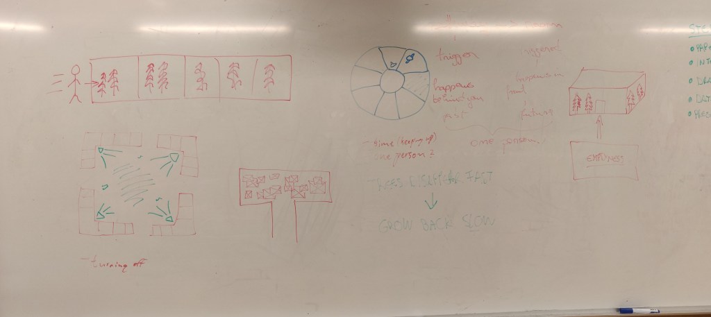
After a brainstorming session we were left with three different concepts. All three different in their own way, and from these three we wanted to come to a clear concept. An image of this brainstorm can be seen below.

  • The first concept (top left) is a metaphor where you run after trees and the trees are much faster and you cannot keep up with them.
  • The second concept (bottom left) is comparable to the Daan Rosegaarden concept. But shows the speed how quickly it builds up and breaks down. Lamps go on slowly and go out just as quickly as deforestation takes place.
  • The third concept (Top left) is a large space that looks very lively from the outside. Natural sounds, many plants and odor. But as soon as you walk in, you end up in a dark room that is completely empty with the sound of chainsaws.

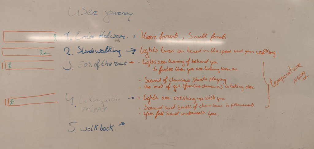
After a brainstorming session we finally came to a good combination of all concepts. We want to make a dark corridor through which a person must walk. Because the user walks slowly, lights are switched on based on the speed the person walks. The smell and sounds of the jungle are slowly becoming clearer. The ground is grass and slowly changes to sand and then to mud. The sound of chainsaws begins to play slowly and becomes louder and louder. The smell of gasoline starts pushing the smell of nature away. Ultimately, the person is at the end of the corridor. Where a mirror hangs. All the lights are on, and the lights go out 6 times as fast as the person took to get there.

Data Phys into

23.11

This week started again with a presentation on the topic of the week. The topic that is now being discussed is Data Physicalization. This is a variant of data visualization. But what is the difference between these two? The goal of data visualization is:

“the use of computer supported, interactive, visual representations of
abstract data to amplify cognition (thought).”

Meanwhile, advances in tangible computing have illustrated how humans can interact with digital information by using their natural ability to perceive and manipulate physical objects and materials.

As such, a research area has emerged that questions why the display of, and interaction with, data should remain limited by the constraints of pixel matrices, two-dimensional gestures and keyboards buttons, and whether moving data representations from flat displays into the physical world could create novel and useful ways of exploring, experiencing and communicating data.

Data physicalization is therefore a way of visualizing data in a three-dimensional way in which the use of multiple senses plays a big role. Of all the subjects that we will be going through this course, I have the least prior knowledge about this subject. I have often made data visualizations but I have never heard of this topic.

And for the presentation I therefore had little interest in this subject. Because my image of data visualizations provoke little to no interaction. But after the presentation my opinion on this subject changed completely. This way of presenting data actually provokes interaction. And it also gives a designer a lot of freedom to think creatively.

The brief we received for the project that we have to complete before Friday

We have also been told what we have to do by Friday. We must first choose a topic that we consider important as a team. For example: Sustainability, Diversity, Design process or something similar. And make a data physicalization from that topic that both informs and provokes.

There four design principles that this data physicalization must meet.

  • Unity:
    The concept needs to include both information and provocation in a single physical product.
  • Coherency
    The concept needs to be coherent as a whole. The forms, behaviors, colors, etc. of information and provocation need to be in harmony with each other.
  • Contextuality
    The concept needs to be contextual. It needs to be designed for, and be suitable for a specific place. (e.g. home, city, school, airport, etc.)
  • Durability
    The concept needs to be sustainable. It needs to have aesthetical and functional values that last in time.

After the presentation I read the articles. At first glance, the articles did not seem too difficult at all. They are fairly short and they are easily written. But I soon realized that they were quite substantive. A lot of information is shared in short pieces and the information varies considerably. There is also a fairly large time difference between the articles, which means that the subject is looked at in a completely different way.

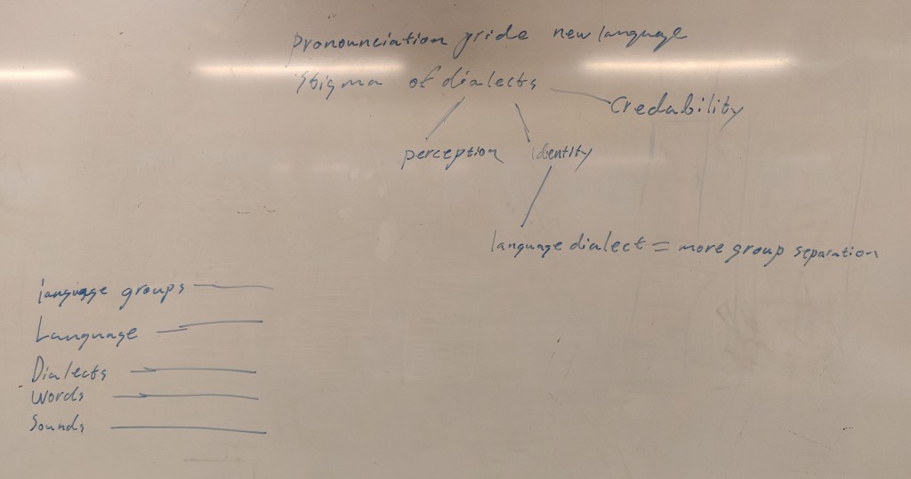
We also started a first brainstorming session with the team on the topic we want to choose. And after brainstorming for a while we came across the subject: “language”. And especially how identity is linked to language. Everyone in our team grew up with a different language and this is linked to steriotypes. This can be positive or negative. But no matter how you look at it, language is part of our identity. And language is always intertwined with another language. What in turn ensures that identities are intertwined.

Unfortunately it was not possible to find enough data about language, but we did find data related to dialects. What we found even more interesting. You can speak the same language and still have prejudices because someone speaks the language slightly differently.

Tomorrow we want to take a good look at the data and think about how we can physicalize this.

Smell seminar

19.11

therefore thought it would be a good choice to link this method of identifying a smell to quartet.

The seminar of this project took place on Thursday. In the morning I took the time to go through the articles again in preparation. I was pretty well prepared for the seminar and, compared to last week, had taken more time to prepare. For example, I have conducted deeper research into sources that have been used. Such as research into the smell of gamers.

However, the seminar itself was less substantive than last week. It seemed more like an open discussion on the subject for which you didn’t necessarily have to read the articles. Despite this, it was interesting. We were given the opportunity to discuss our concepts and receive feedback. And luckily our concept of categorizing scents seemed interesting. But we have to think about how we can keep the game interesting. For example, the game is currently a way to teach people how to identify smells. But how can we ensure that it remains interesting once people have learned this? So we will have to think about an extra layer in the game. One where you can put the knowledge you have gained on the test.

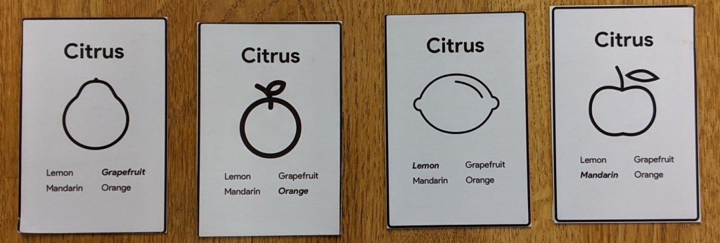
We spent the rest of the day making the prototype and the presentation. Before we could actually start making the prototype, we had to think about how we could apply different layers. And after some brainstorming, we ended up with two different levels in the game. The first level is a more classical form of quartet in which visual information is central. Smell was implemented in it by linking it to the cards. If you want someone’s card, you must first smell the cards of the other players. If you have guessed the scent, you will receive the card from the opponent. This way you can teach a group of players to categorize and recognize smells. The visual side of the cards serves as a check to see if the smell is correctly identified. An image of this prototype can be seen below.

The second level is almost the same, the biggest difference is that the visual confirmation is missing. The only check that exists is in the form of a QR code. As soon as a player thinks he has a quartet, the codes of these cards are scanned to check whether these cards have been correctly identified. Once all cards have been correctly identified and all four fall within the same category, the player has a quartet.

The first level therefore serves more as an introduction to the second level. The second level was our original idea, but after the seminar it seemed logical to incorporate the first level. The second level also fits in well with the article: “Beyond Smell-O-Vision: Possibilities for Smell-Based Digital Media” (Jonas K. Olofsson et. all, 2017). It concludes that games that only focus on smell develop our cognitive capacities better than a combination of visual and smell.

We wanted to make the prototype itself as simple as possible in order to focus on the smell. Mainly in the second level the playing cards only consist of an icon to indicate where the scent is and the QR code.

The final presentation went quite smoothly. The concept was clear and the steps we had taken in our design process were logical. The only thing that could be better about the presentation itself was the explanation about the original game “quartet”. The majority of the class was not familiar with the game. Perhaps it would have been useful to give a brief demonstration of the original game. So the step towards explaining our concept went more smoothly.

All in all, I am very satisfied with this week. And I will definitely use smell in my design process in the future, if the opportunity arises.

Smell workshop

20.11

The workshop took place on Wednesday. The first part of the workshop was a presentation on the use of smell linked to games. Unfortunately, all the examples that were discussed during this presentation could be found in the articles. And since I had read the articles yesterday, there was not too much new information.

The second half of the workshop was very interesting. We worked with smell material such as vortex cannons and scent eggs. It was quite valuable because you realised how easy it can be to come up with a game focused on smell. By adding a number of game mechanisms.

In the afternoon my team and I started thinking about what we can do for the project. The aim of this project is to convert an existing game into a game where smell is a central game mechanic. In this game it is intended that players come into contact with smell and learn from it.

During the first brainstorming session, a number of ideas quickly emerged. For example, we wanted to convert the game slander man into a game where you have to rely on scent instead of visual cues. The reason for this is because we had found research that showed that smell and danger are very closely intertwined. Smell is the first sense that can assess a dangerous situation. And since slender man is a fairly simple horror game where you have to rely on your visual senses, we thought we could use this easily. But when we started to think about a concrete prototype, we got stuck. For example, we should start programming an actual game fairly quickly. And we didn’t have enough time for this.

We focused on simpler games. And after some brainstorming, we eventually to go with quartet. This is a game that is mainly played in the Netherlands and Germany. It is a card game where the goal is to make as many quartets as possible. The game consists of 32 cards divided into 8 categories. Each category consists of four cards, which is a specification of the category. For example, the theme of the quartet game can be animals. A category can then be birds. This category of birds is then subdivided into specific birds, such as a parrot. If you have all four specific cards within a category you have a quartet.

This way of categorizing and specifying was also discussed a lot during the presentation. When identifying a smell, it is useful to first categorize it. For example, is it a plant? or a mineral. We therefore thought it would be a good choice to link this method of identifying a smell to quartet.

Smell introduction

18.11 / 19.11

After finishing everything last week, we will start a new topic this week. This week is all about “smell”, and how you can work with this as an interaction designer. I was really looking forward to this topic. Within the subject of “senses” I mainly came into contact with “vision” during my studies. And there were courses that focus on other senses such as touch, sound but smell has never been discussed. Which I have always found strange. Before I started my design education, I studied psychology, where scent was just as important as any other sense, if not more important.

On Monday the module started with a presentation that served as an introduction for the rest of the week. The presentation was very interesting. In advance, I did not expect gamification to play a major role in this project. But by linking it to games, “smell” got a clear function. And it did not feel like a part that is linked to something as I had expected in advance.

After the presentation, I took the time to read through the articles linked to the project. In general, the articles were interesting. It was inspiring to see how scent can be linked to games to create a unique experience. Such as incorporating of the smell of rubber on the disk of a racing game. To increase the immersion in the game. I personally think that scent can play a major role in immersion this way. I base this on my own experiences. I once developed a VR game for a project in which we consciously dealt with smell to increase immersion. And from my own findings, this indeed appeared to have an influence on the degree of immersion.

I write here very consciously, based on my own experiences and would never want to claim that this really has an impact. And I think that’s my only criticism of the articles. A number of strong claims are made that could have been better substantiated. For example, research is being conducted into whether games stink or not. For this they go to a forum for gamers to distribute a survey. This revealed that 84% of the respondents answered that gamers stink. This is a pretty extreme number so I went to the forum to see how valid this is. And it comes across as a forum for a specific group of gamers that does not match the stereotype gamer. So it seems like a strong claim to say something about gamers as a general target group.

Ontwerp een vergelijkbare site met WordPress.com
Aan de slag